Year
2024
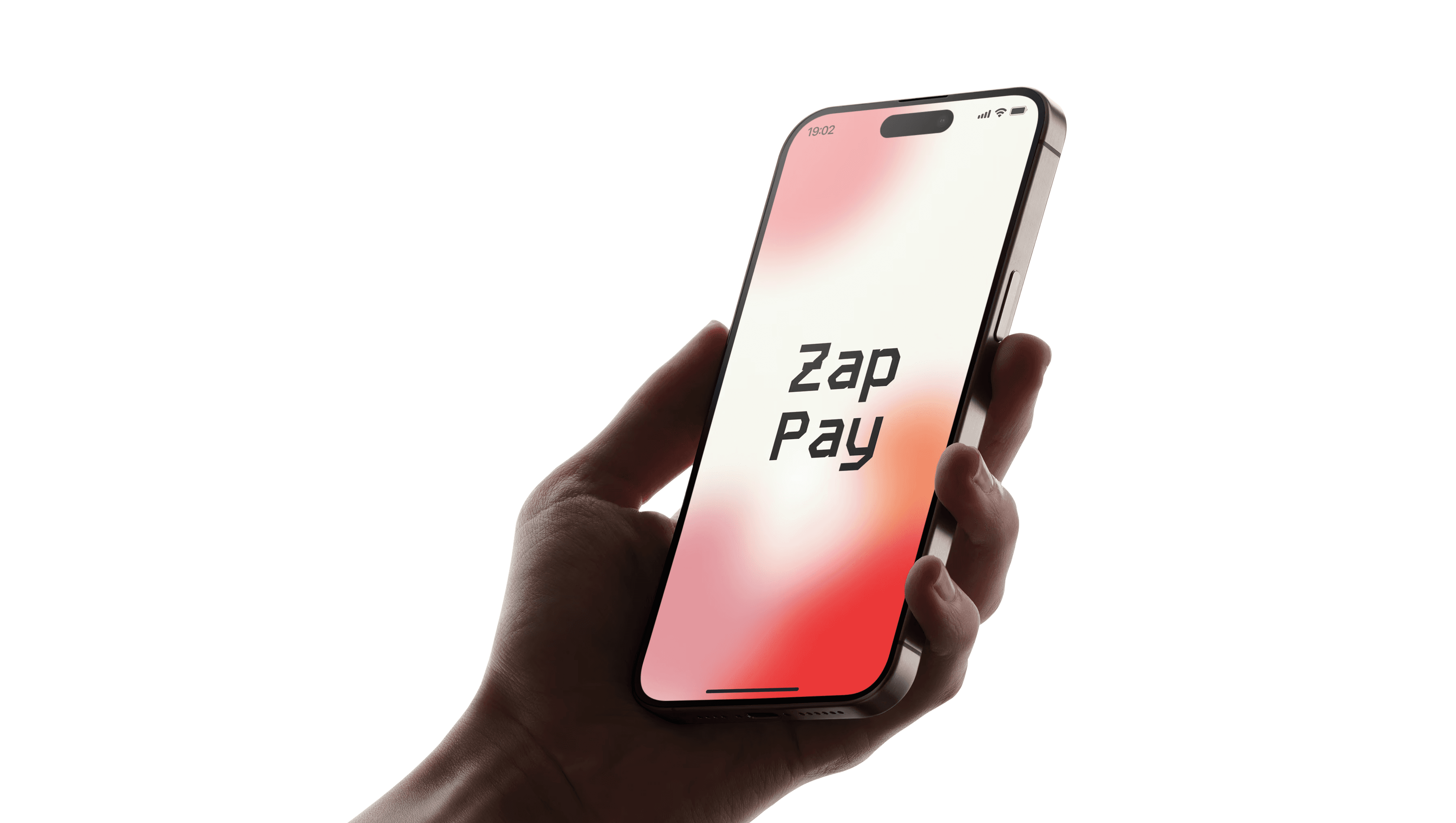
Myself
Zap Pay
Category
UI Design
job Duration
2 - 3 Weeks
The design process began by analysing user expectations around digital payments, convenience, clarity, and security. I studied popular wallet apps to identify common UX patterns, pain points, and gaps in visual clarity. User personas and behaviour flows were mapped out to ensure Zap-Pay met both functional needs and emotional comfort, especially for users new to digital finance.
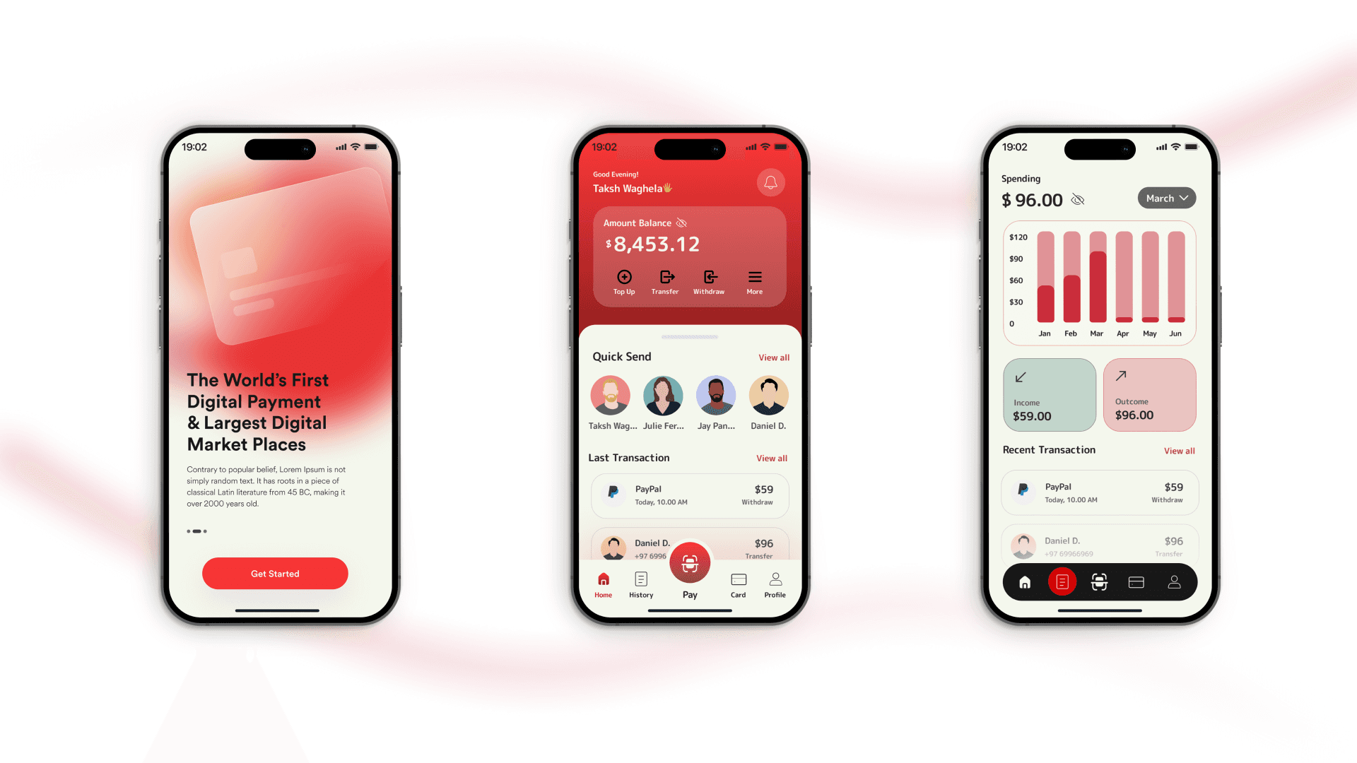
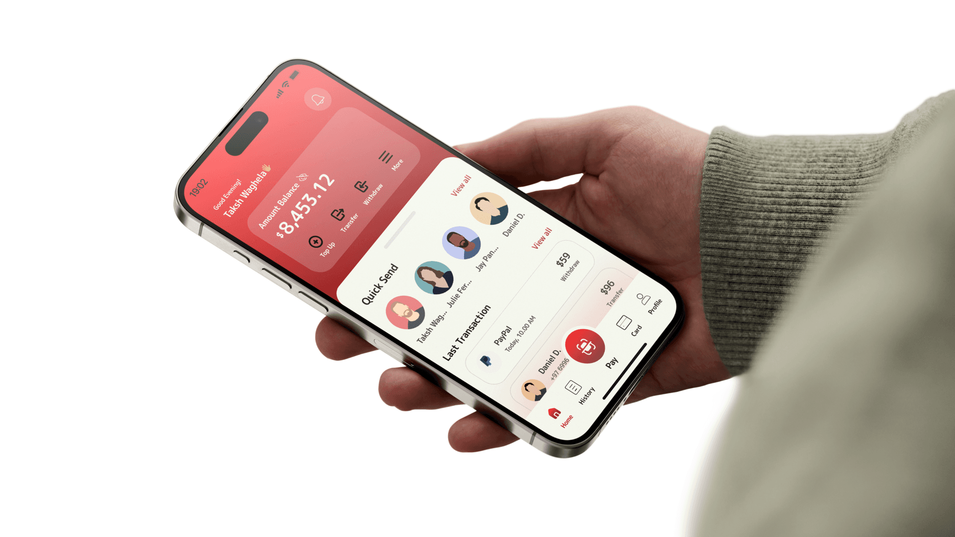
ZapPay’s design system is driven by a bold red palette to signal energy, action, and urgency, while soft gradients and rounded edges add warmth and approachability. Clear typographic hierarchy, high-contrast cards, and intuitive icons guide the user through actions like transfer, top-up, or withdrawal. Every screen was built in Figma with a mobile-first mindset and micro-interaction logic in place.
While this was a UI-focused project, the interface was structured for seamless handoff and easy integration with front-end dev teams. Components were designed to be scalable across devices, with modular card designs and dynamic layout grids. Zap-Pay’s interaction design also considered real-world constraints like screen latency, button reach zones, and native OS behaviours.
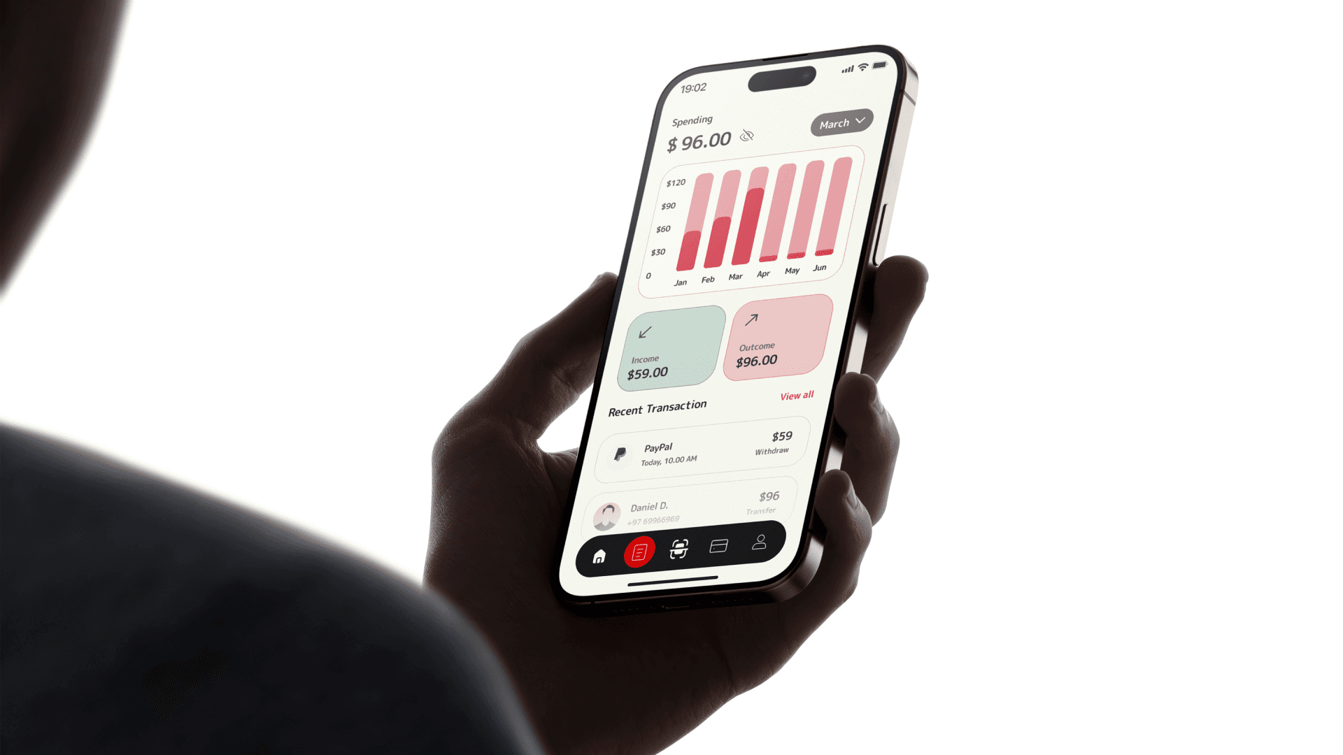
ZapPay was built around one core idea: money, made simple. It’s not just a wallet but a frictionless bridge between users and their finances. The concept embraces clarity, trust, and modernity, turning every tap into a confident decision. From onboarding to insights, every screen is crafted to feel quick, smart, and empowering.