Year
2024
Myself
taksh waghela
Category
Webpage Design
job Duration
3 - 4 Weeks
Every powerful landing page begins with clarity, and wireframing lays the groundwork. My process starts by mapping structure, intent, and user flow using low-fidelity sketches or digital layouts. Wireframes help define the narrative hierarchy, outline CTAs, and visualise responsiveness early on. Whether it's for a sleek product or a bold brand launch, I rely on tools like Figma and pen-on-paper sketches to plan every screen element intentionally before diving into full design.
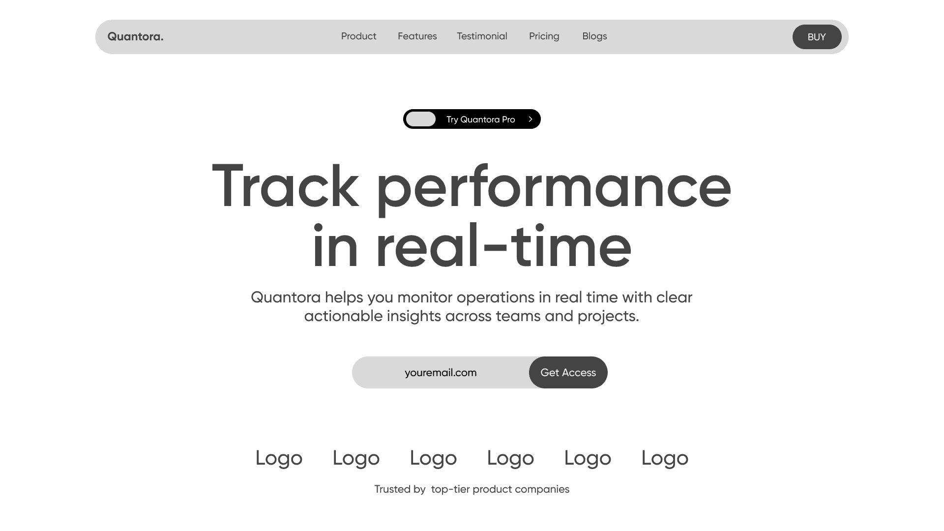
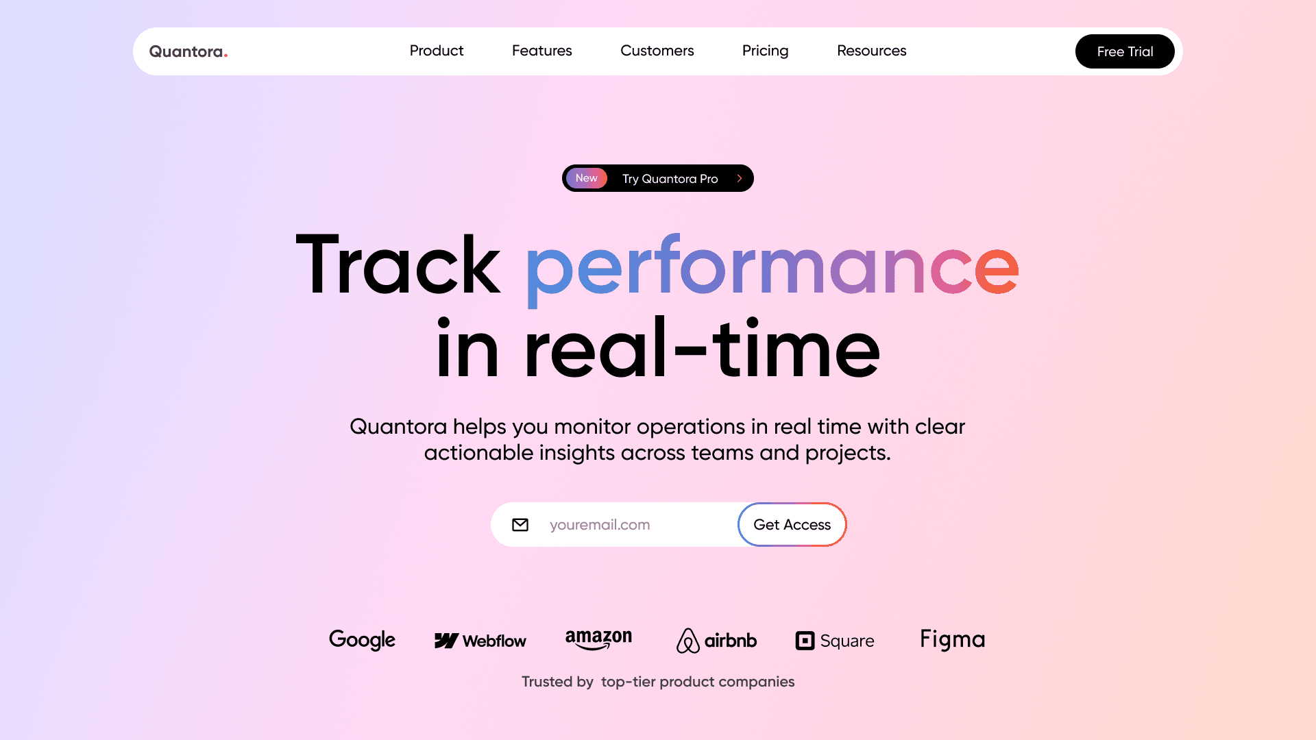
Quantora is a productivity-driven SaaS tool, and the landing page was designed to reflect clarity, speed, and credibility. I used a structured grid, sleek typography, and friendly UI elements that make onboarding easy and approachable. The visual tone combines clean whites with brand blues and soft shadows, offering a confident pitch to both startups and enterprises. I kept sections modular for future scalability, all while maintaining a strong above-the-fold impact.
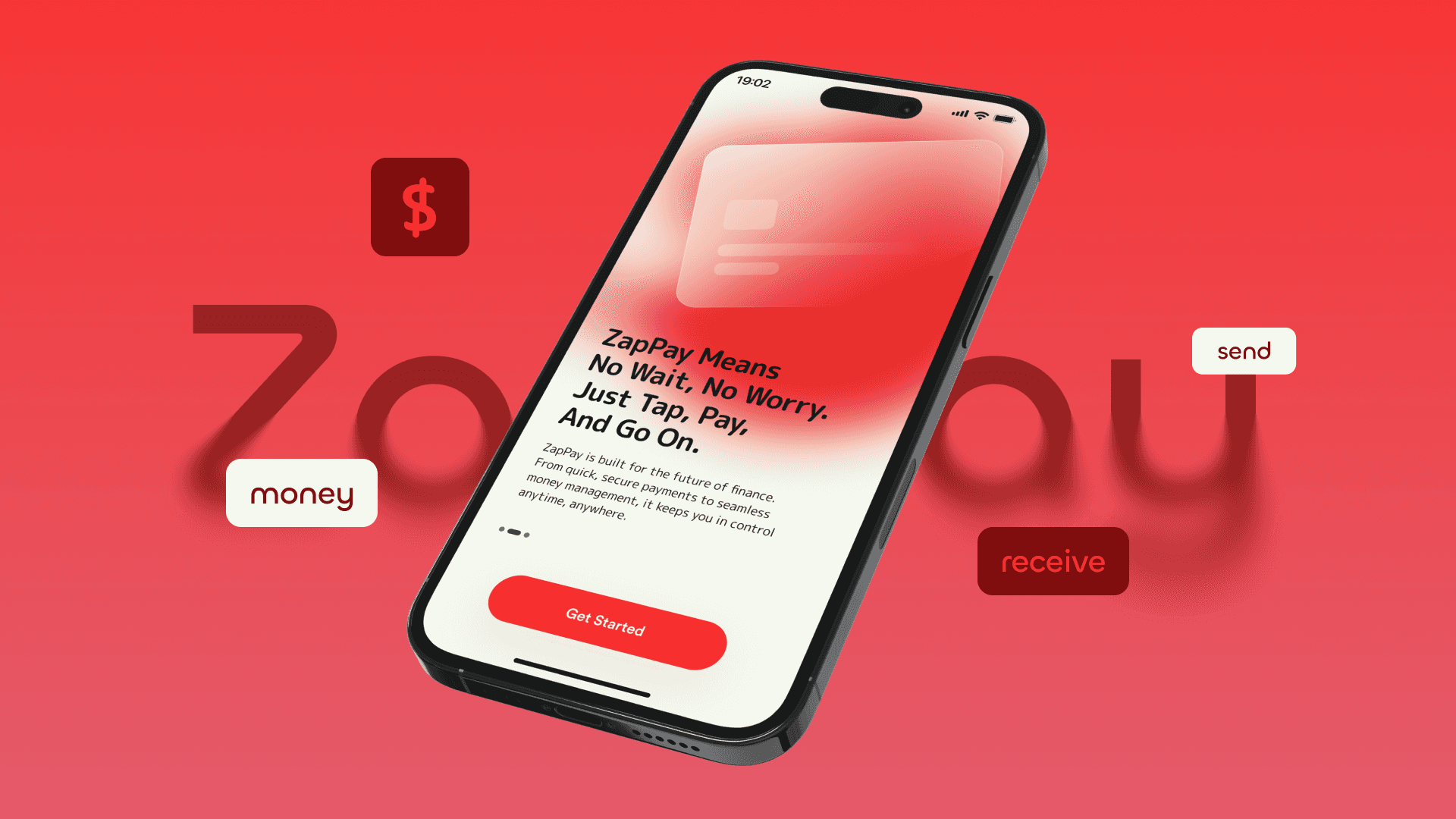
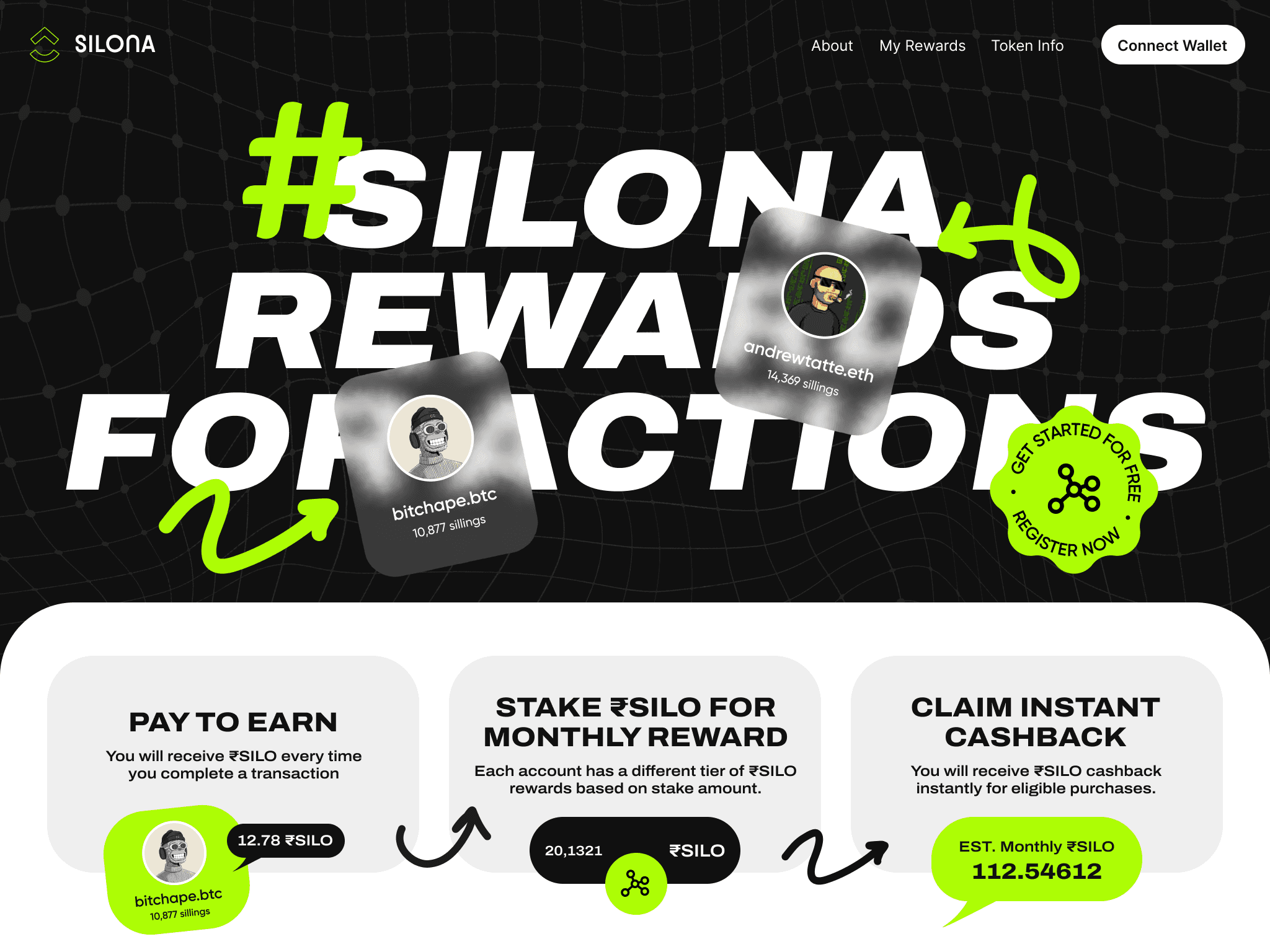
With crypto products, trust and innovation go hand in hand. For Silona, the landing page was crafted to feel secure, tech-savvy, and forward-looking. I used bold contrast, frosted glass cards, and a dark theme with glowing accents to bring out that Web3 aesthetic. Motion, icons, and clean hierarchy helped communicate core features like wallet linking, security layers, and token support, while keeping things intuitive and fast-loading.
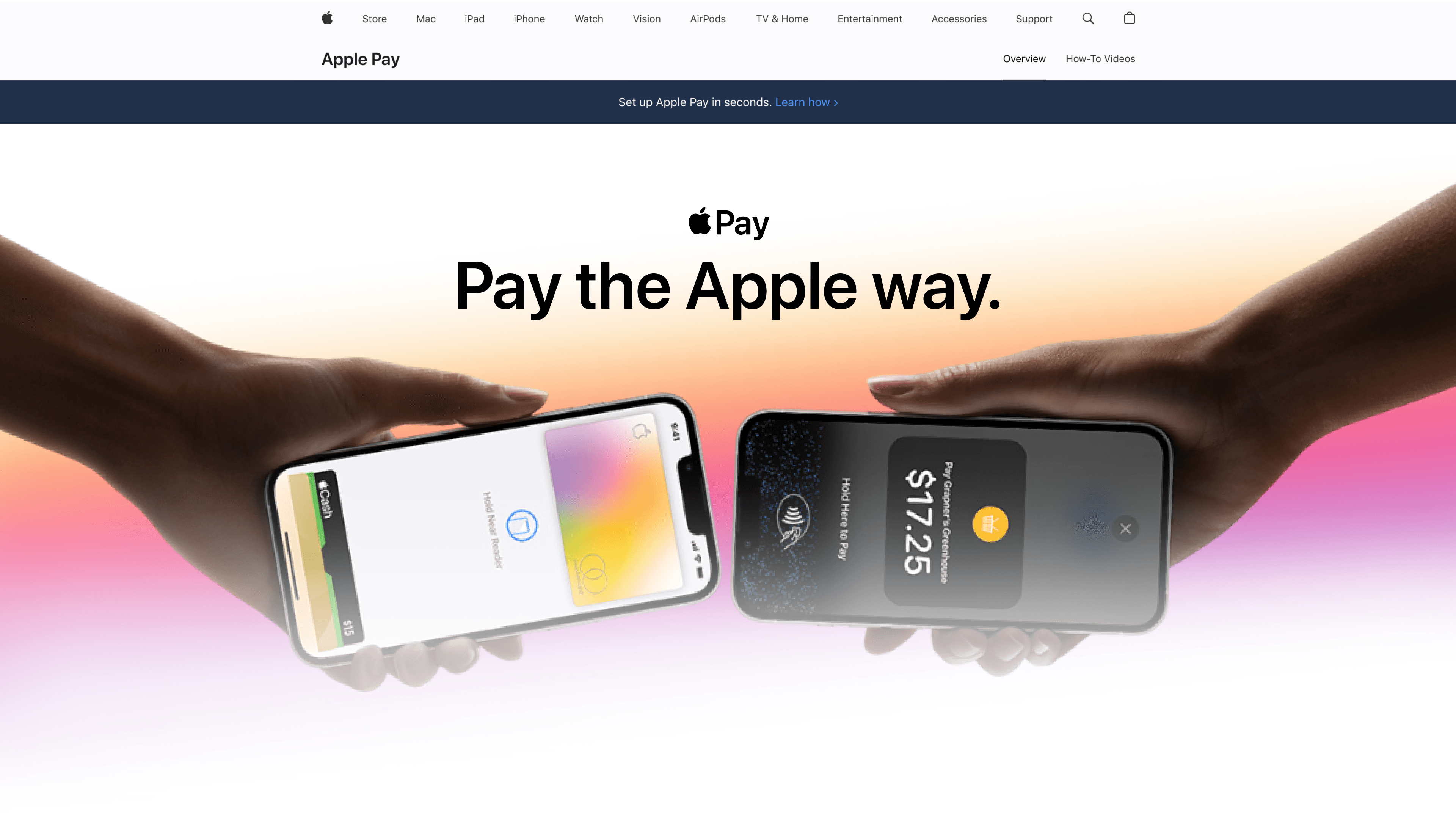
Apple Pay already has strong brand recall, so this redesign focused on tightening the user pitch for new customers. I preserved core Apple-like visual elegance but added structure through more defined grids and typography hierarchy. The hero section is all about familiarity and trust, while the rest introduces benefits, supported banks, and CTA clarity. The aim? Keep it Apple-smooth, but elevate conversion effectiveness through clearer narrative flow and modular content.