The Role of Aesthetic in Functionality
Good design doesn’t just look good; it works well. This blog explores how I balance style with function, especially in UI projects. I break down how clean design systems can make apps feel more usable, fast, and trustworthy. Visual flair and usability aren't opposites—they are often two sides of the same coin.
Author
READ
Category
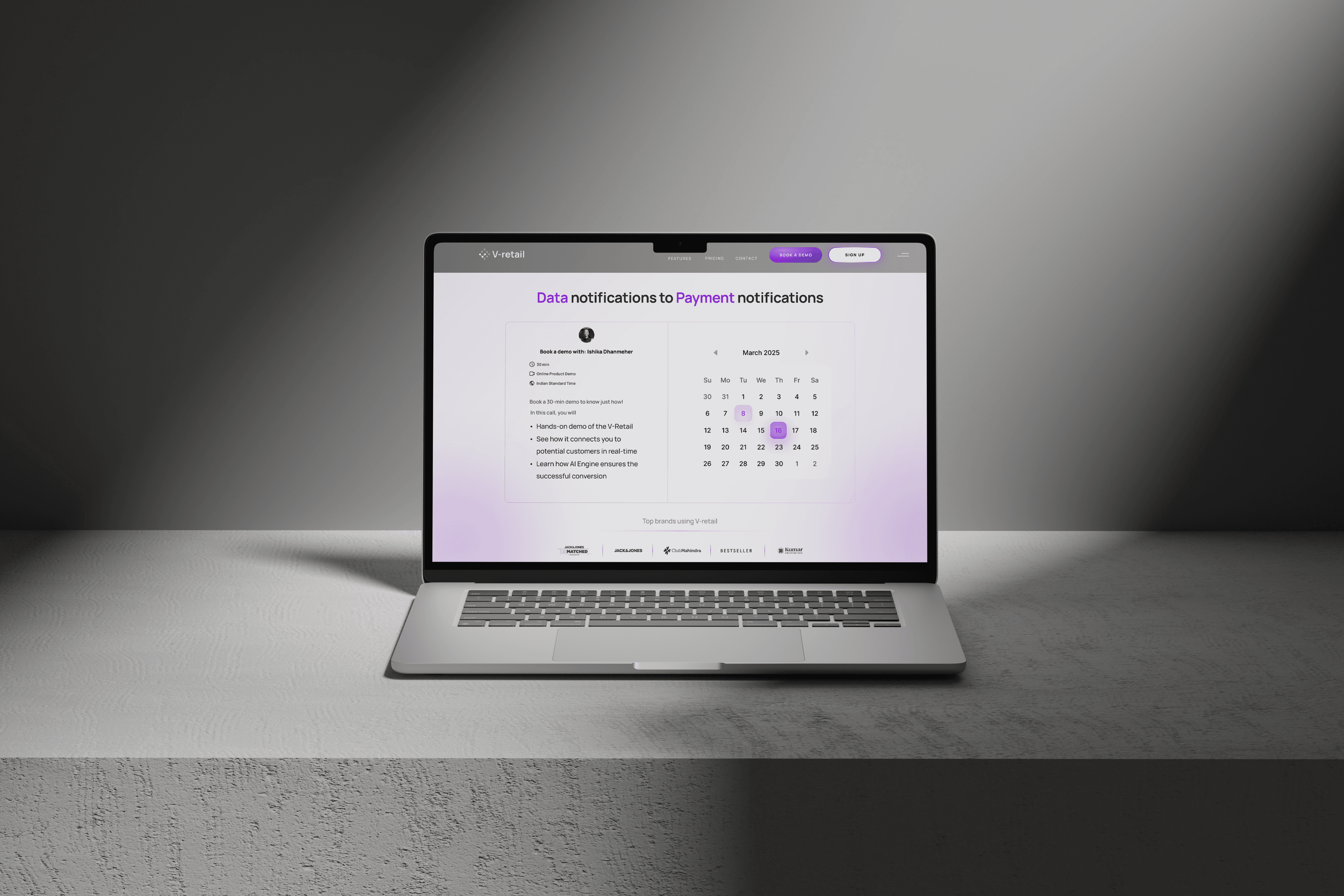
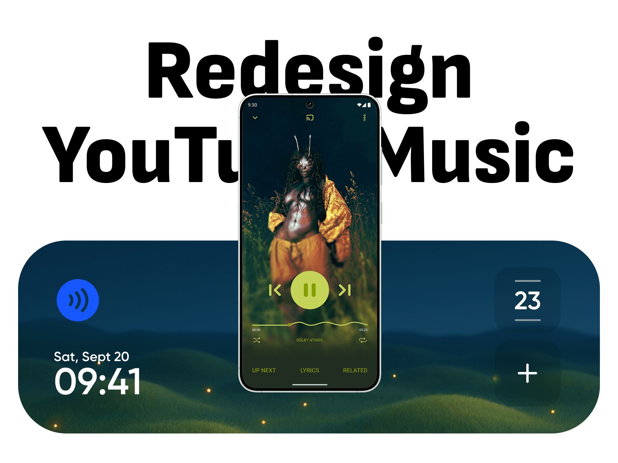
In my UI work, I aim to strip away friction. That means consistent typography, calm color schemes, minimal shadows, and a predictable visual hierarchy. These choices reduce decision fatigue for users. When design feels invisible, it means it’s working. I approach every app as a tool first, making sure it's usable in low light, fast to read, and mobile-responsive across devices.

Style can be a tool to create hierarchy, guide attention, and emotionally cue behaviour. A bold CTA button, a microinteraction, or a visual separator line can help people understand where to go and what to do next. I often use gradients, blur, and motion not just for beauty, but to reinforce logic. Aesthetics should never be an afterthought; it’s part of how we shape trust and usability.
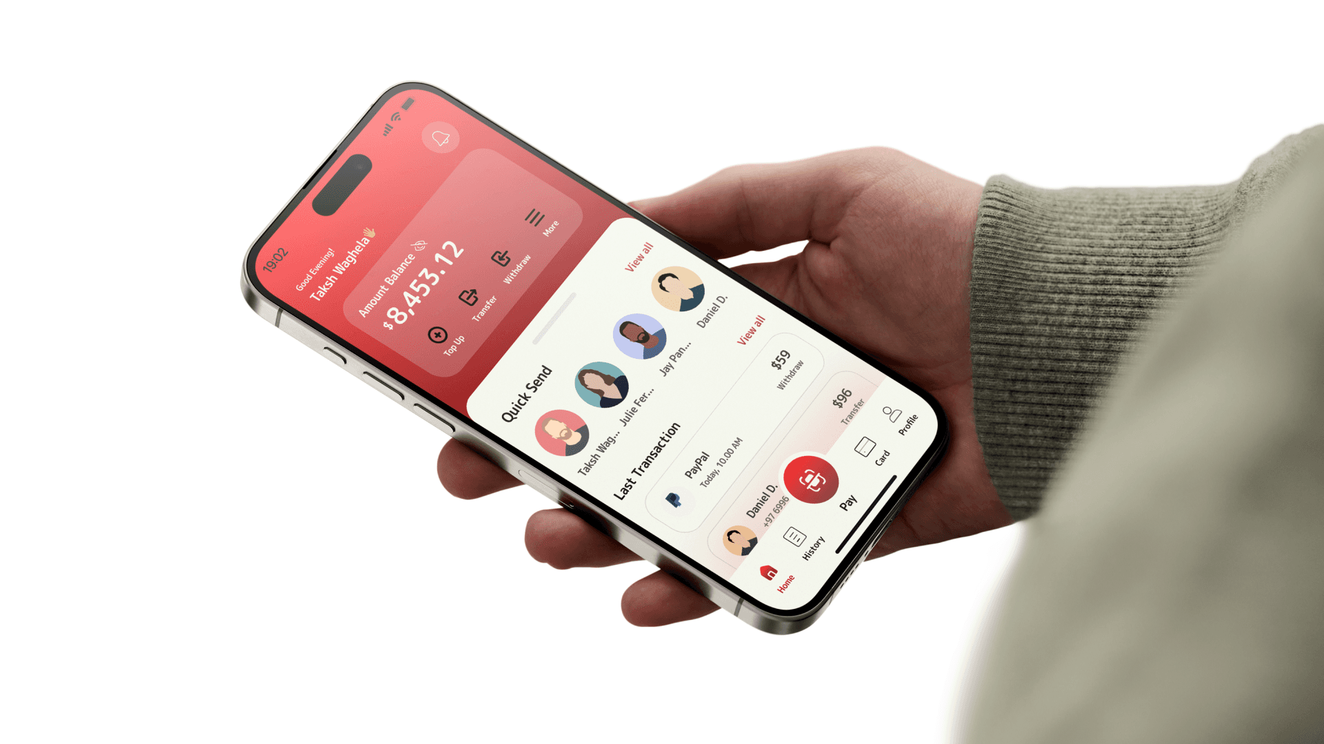
In my Note App concept, I blended soft typography with swipe gestures and AI-driven writing suggestions. The interface felt personalised yet familiar, and the visual styling elevated the tool without distracting from function. Similarly, in the ZapPay wallet project, I used material design language with custom colour theory to make a payment app feel inviting, not just functional.